Tuesday, 21 June 2011

Photography 1: The Art of Photography

Project: The time of day
Exercise: Light through the day.

For this exercise I photographed one scene from dawn to dusk.  I took one picture per hour throughout the day and one per half-hour at the end of the day, when the light was changing faster.

I used a tripod and cable release.

The images are shown below:

5560.jpg; 7:00am; F16; 1/6s
5561.jpg; 8:00am; F16; 1/10s
5510.jpg; 9:00am; F16; 1/10s
5511.jpg; 10:00am; F16; 1/8s
5531.jpg; 11:00am; F16; 1/10s
5532.jpg; 1:00pm; F16; 1/30s
5533.jpg; 2:00pm; F16; 1/30s
5512.jpg; 3:00pm; F16; 1/10s
5534.jpg; 4:00pm; F16; 1/15s
5535.jpg; 5:00pm; F16; 1/10s
5529.jpg; 6:00pm; F16; 1/45s
5553.jpg; 7:00pm; F16; 1/10s
5554.jpg; 7:30pm; F16; 1/4s
5555.jpg; 8:00pm; F16; 1/3s
5556.jpg; 8:30pm; F16; 1s
My favourite image is image 5560, taken at 7:00am.  The light at this time of day has produced sharp definition in the image combined with a warm tone.  I expected this light would be best due to the low slanting light.

What have I learned from this exercise?

The use of side lighting, such as that available at the beginning and end of the day due to its capacity to emphasise contours, textures and forms is the best form of lighting.  The obliqueness of light also creates a stronger contrast between the paler and darker surfaces in a subject and so brings out much greater definition of form.

Tuesday, 7 June 2011

Photography 1: The Art of Photography

Project: The colour of light.
Exercise: Judging colour temperature.

For this exercise I chose a subject that could be moved around and that did not have a strong colour.  I chose to use a straw hat as it was a plain light colour.  The photographs were all taken during very clear weather.

Three photographs were taken, one in full sunlight during the middle of the day, one in shade during the middle of the day and one in sunlight when the sun was close to the horizon.  The camera's white balance was set to daylight for each of the three shots.  The three images are shown below:

Full sunlight, middle of the day.


5182.jpg; Pentax *istD; 18-55mm lens; F13; 1/750s; WB Daylight
Shade, middle of the day.
5185.jpg; Pentax *istD; 18-55mm lens; F13; 1/60s; WB Daylight
Full sunlight, sun close to horizon (evening).

5194.jpg; Pentax *istD; 18-55mm lens; F11; 1/125s; WB Daylight
The image taken in midday sunlight is lit with a neutral light and gives the truest rendition of the colours.  The colours of the image taken in the shade are muted with a bluish cast and look unnatural.  The image would look better if it were neutral.  The image taken when the sun is close to the horizon has a warmer more orange cast.  The orange cast of third image is quite attractive.

Now, I took a similar situation to that in the first part of the exercise and shot the same 3 kinds of picture, but for each one I varied the camera's white balance setting to Daylight/Sunlight, Shade setting and Auto.  The nine images produced are shown below:

Full sunlight, middle of the day.

5187.jpg; Pentax *istD; 18-55mm lens; F11; 1/1000s; WB Daylight
5188.jpg; Pentax *istD; 18-55mm lens; F11; 1/1000s; WB Shade
5189.jpg; Pentax *istD; 18-55mm lens; F11; 1/1000s; WB Auto
Shade, Middle of the day.

5190.jpg; Pentax *istD; 18-55mm lens; F11; 1/90s; WB Daylight


5191.jpg; Pentax *istD; 18-55mm lens; F11; 1/125s; WB Shade
5192.jpg; Pentax *istD; 18-55mm lens; F11; 1/125s; WB Auto
Full sunlight, sun close to horizon (evening).

5195.jpg; Pentax *istD; 18-55mm lens; F11; 1/180s; WB Daylight
5196.jpg; Pentax *istD; 18-55mm lens; F11; 1/180s; WB Shade
5197.jpg; Pentax *istD; 18-55mm lens; F11; 1/180s; WB Auto
For the images taken in the full sun, image 5187, with daylight white balance setting has the truest colour tone. Image 5188, with shade white balance setting is too yellow.  Image 5189 with Auto white balance setting has muted colours with a "bleached out" look.

For the images taken in the shade in the middle of the day, image 5190 with daylight white balance setting has corrected for the shadow light well but has a slightly bluish cast.  The colours are more muted.  Image 5191, with shade white balance setting has produced a well exposed image.  The colours are natural.  Image 5192, with auto white balance setting has muted colours with a more of a bluish cast than with that produced with the daylight setting.

Image 5195, taken with a daylight white balance setting has the best rendition of colours of the three taken in full sunlight with the sun close to the horizon.  The warm orange tone looks natural and is quite attractive.  Image 5196 is too orange and image 5197 has an unattractive, desaturated look.

What have I learned from this exercise?

A warm, orange tone adds impact to a photograph.  Warm colouration in a picture is much more inviting than a cold cast as it gives the viewer a feeling of well being.  When shooting a subject that is in shade with a bright blue sky, setting the camera's white balance setting to shade effectively counteracts the cold colour cast produced.

Conveying a feeling of cold and isolation in a bleak landscape is a classic use of cool-tones.  To give an image a cool-tone, use a white balance setting with a colour temperature lower than the light that you are shooting in (in daylight 5,500K, use an Incandescent 3,000K setting, for example).

When shooting autumn colours, when the sun is higher in the sky during the middle of the day the higher colour temperature makes your images appear more blue.  This cooler light is not the best for capturing autumn colours.  You can compensate for this by using a Cloudy white balance setting.

For shooting portraits in varied lighting conditions, the best solution is to shoot in RAW mode and adjust the white balance when the images are processed.

Interesting effects can be obtained by using colour casts caused by mixed lighting.  Setting the white balance for the artificial lighting used for many interiors at dusk can turn the sky a strong blue, (see David Churchill).

In each of the sets of photographs above, the best image is produced by using the correct colour balance setting for the conditions rather than the Auto setting.

Photography 1: The Art of Photography

Project: The intensity of light.
Exercise: Higher and lower sensitivity.

For this exercise I took similar shots at both normal and high sensitivity.  I chose situations that were marginal, that is where the mixture of light level and subject movement or depth of field is only just possible.  I took the first photograph at normal sensitivity, (ISO 200), then changed to a higher sensitivity, (eg ISO 400 or 800).  I looked at the two photographs to see whether the change made shooting easier.  In particular, could the photograph not be made successfully at the lower sensitivity but was possible at the higher setting?

I compared the two images close up (at 100%).  I looked in two kinds of area in the picture, ie those that are smooth, with little detail and neither particularly bright nor dark, and also in the deep shadow areas.  I noted the obvious differences.

The pairs of images are shown below:


5174.jpg; Pentax *istD; 18-55mm lens; F22; 1/6s; ISO 200

5175.jpg; Pentax *istD; 18-55mm lens; F22; 1/15s; ISO 800


5177.jpg; Pentax *istD; 18-55mm lens; F22; 2s; ISO 200

5178.jpg; Pentax *istD; 18-55mm lens; F22; 1/2s; ISO 800
The four images above were taken using a tripod to hold the camera steady and as there was no movement in the images a long exposure time was possible without causing problems.  Therefore the lower ISO number could be used to produce a better image, with less noise.

5203.jpg; Pentax *istD; 18-55mm lens; F4.5; 1/4s; ISO 200


5202.jpg; Pentax *istD; 18-55mm lens; F4.5; 1/10s; ISO 800
The two photographs above were taken with the camera hand held.  The shutter speed of 1/4 second when the sensitivity was set to ISO 200 meant that the resulting image was blurred.  The higher ISO setting of 800 meant that a successful image could be produced by bracing the camera against a solid object.

5206.jpg; Pentax *istD; 18-55mm lens; F11; 1/30s; ISO 200


5207.jpg; Pentax *istD; 18-55mm lens; F11; 1/125s; ISO 800

5219.jpg; Pentax *istD; 18-55mm lens; F9.5; 1/60s; ISO 200

5218.jpg; Pentax *istD; 18-55mm lens; F9.5; 1/180s; ISO 800


5227.jpg; Pentax *istD; 18-55mm lens; F9.5; 1/90s; ISO 200

5228.jpg; Pentax *istD; 18-55mm lens; F11; 1/180s; ISO 800


The above images were taken in very poor lighting conditions with a heavy mist and drizzle.  The images produced using a lower ISO number were markedly less noisy than those produced using the higher ISO number.

What have I learned from this exercise?

Higher sensitivities can be used, by increasing the ISO number on the camera but the resulting images will have more noise.  Close inspection of the image in smooth areas, with little detail and in deep shadow areas will reveal that a marked increase in noise will be present when a high ISO setting is used.

This increased noise level may be acceptable if the photo is to be printed small or if the subject of the photograph is so interesting that the noise is hardly noticeable.

Friday, 6 May 2011

Photography 1: The Art of Photography

Project: The Intensity of Light
Exercise: Measuring exposure

Part 1: For this exercise I produced four photographs that are deliberately lighter or darker than average.  The images are shown below:
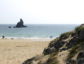
5156.jpg; Pentax *istD; 18-55mm lens; F/22; 1/250s

This photograph was produced deliberately lighter than average to portray the feeling that is felt when on the beach on a bright sunny day.
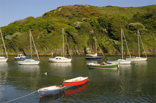


5728.jpg; Pentax *istD; 18-55mm lens; F/22; 1/125s
This photograph has been produced deliberately lighter than average to make the most of the colours of the boats on the water and the green and blue of the background.  This gives a bright, cheerful mood to the image.
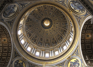
Nikon D300; 18-70mm lens; F/9; 1/13s
This photograph was produced darker than average to add a sombre, ecclesiastic mood to the image.  The inside of the church was kept deliberately dark to contrast with the brightness of the light from the windows in the dome.
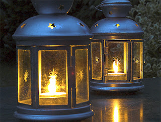
Pentax *istD; 18-55mm lens; F/22; 4s
This image was produced darker to create a more romantic mood and to contrast the brightness of the candles against the background.

Part 2:  For this part of the exercise I took five different photographs.  For each one I made five exposures, arranged around the one recommended by the camera's computer as the best exposure.  The first one was one stop darker, the second half a stop, the third average, the fourth half a stop lighter and the fifth one stop lighter.

Once the photographs had been processed, I looked at them to see whether the central exposure was what I wanted.  Next I looked to see if any of the other exposures were acceptable.

The images that were acceptable are shown below:
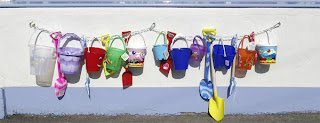
5104.jpg; Pentax *istD; 18-55mm lens; F/11; 1/1000s
 This photograph was taken using the camera's recommended exposure settings.

 The next two photographs were taken at half a stop lighter and one stop lighter respectively.
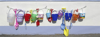
5105.jpg; Pentax *istD; 18-55mm lens; F/11; 1/500s
5106.jpg; Pentax *istD; 18-55mm lens; F/11; 1/350s
All three of these photographs are perfectly acceptable in their own right. I prefer the second photograph, (half a stop lighter exposure) as the result is a brighter image.
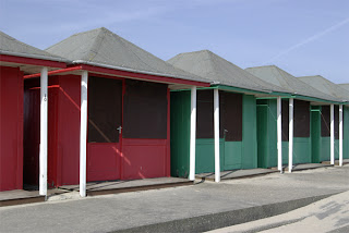
5114.jpg; Pentax *istD; 18-55mm lens; F/11; 1/180s
This photograph was taken using the camera's recommended exposure settings.

The next photograph was taken at half a stop lighter.
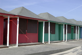
5115; Pentax *istD; 18-55mm lens; F/11; 1/125s
This photograph is perfectly acceptable in its own right.  The longer exposure has resulted in more detail being shown in the shadow areas without noticeable washing out of the sky.
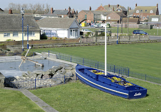
5124.jpg; Pentax *istD; 18-55mm lens; F/11; 1/350s
This photograph was taken using the camera's recommended exposure settings.

The next photograph was taken at half a stop darker.
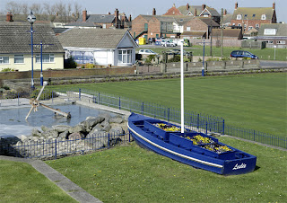
5123.jpg; Pentax *istD; 18-55mm lens; F/11; 1/500s
This photograph is perfectly acceptable in its own right.  The shorter exposure has resulted in more saturated colours without too much darkening of other detail in the image.
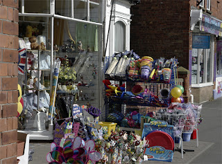
5099.jpg; Pentax *istD; 18-55mm lens; F/11; 1/350s
This photograph was taken using the camera's recommended exposure settings.

The next photograph was taken at half a stop lighter.
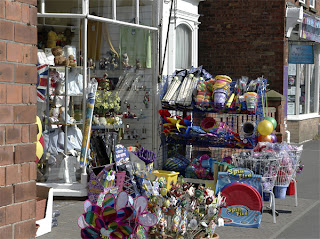
5100.jpg; Pentax *istD; 18-55mm lens; F/11; 1/250s
This photograph is perfectly acceptable in its own right.  The longer exposure has resulted in more detail being shown in the shadow areas without noticeable washing out of the other areas.
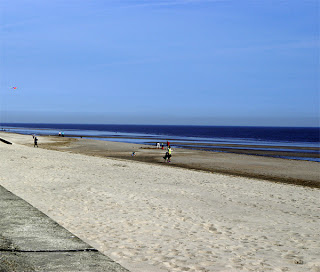
5129.jpg; Pentax *istD; 18-55mm lens; F/11; 1/350s

This photograph was taken using the camera's recommended exposure settings.


The next photograph was taken at half a stop darker.
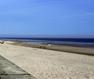
5128.jpg; Pentax *istD; 18-55mm lens; F/11; 1/500s
This photograph is perfectly acceptable in its own right.  The shorter exposure has resulted in more saturated colours without too much darkening of other detail in the image.


What have I learned from this exercise?

It is often advantageous not to blindly accept the meter reading, as small changes in the exposure can often result in improved images.  It is worth bracketing exposures with at least half a stop either side of the recommended.  Many times half a stop lighter can reveal more detail in the shadow areas without too much loss of detail in the bright areas.  Half a stop darker can produce more saturated colours in the image.

Saturday, 2 April 2011

Photography 1: The Art of Photography

Photograph scanned from a national newspaper.

Chinese Bus Stewards

This image features bus stewards posing for photographs as they wait for delegates attending a session of the National People's Congress held in the Great Hall of the People in Beijing.  There is an interesting optical beat in the photograph with all the stewards dressed in similar uniforms.  One of the stewards has turned to face the camera which helps to break up the pattern.  The red of the steward's coats is echoed in the red flags along the roof of the building.